



















What makes marketplace website design different?
Marketplace website design is different because one site has to persuade two groups who want opposite things. Buyers want choice, low prices and safety. Sellers, hosts or providers want demand, fair fees and control. A generic agency usually writes the homepage for one of them and adds a "Become a seller" link in the footer, which leaves the other side guessing.
The second difference is the chicken-and-egg problem. Early on you don't have much supply to show buyers, or many buyers to promise sellers, so the site can't lean on volume. It has to sell the idea, the quality bar and the mechanics instead. Our roundup of B2B marketplace websites shows how established marketplaces handle two-sided messaging; this page is about doing it for a startup that's still building liquidity.
The third is that the marketing site and the product blur together. Category pages, listing pages and search results are often the pages people land on first, so their design is marketing as much as UX.
Which side should your homepage speak to first?
Your homepage should speak first to the side that's hardest to win right now, and give the other side a visible, one-click path. That's usually the scarce side. In many early marketplaces it's supply, because buyers won't come until there's something to buy. Later it often flips to demand. Decide this on purpose, because a homepage that addresses both equally tends to say nothing to either.
Your situation | Lead the homepage with | Give the other side |
|---|---|---|
Pre-launch, recruiting supply | The seller or provider pitch: demand, fees, control | A waitlist for buyers |
Supply in place, demand is thin | The buyer pitch: what they can get and why it's safe | A clear "Join as a seller" path in the nav |
Both sides growing, mostly self-serve | The buyer pitch, with search near the top | A dedicated seller page and onboarding |
B2B marketplace with sales-led supply | The buyer problem and the vetting process | A partner or vendor application page |
Managed marketplace | The outcome and how matching works | A provider page about standards and pay |
If you're collecting interest before launch, our guide to waitlist landing pages covers how to capture each side separately so you know who signed up.
How do you write two-sided marketplace messaging?
Good two-sided marketplace messaging uses one brand voice and one core promise, then translates that promise into what each side gains. The promise is the match itself, for example "vetted contractors, booked in a day". The buyer version talks about speed and safety; the seller version talks about steady work and getting paid on time. Same idea, two angles.
- One headline per side: the homepage hero speaks to the lead side, and the seller page gets its own hero instead of a reused one.
- Name the fees plainly: sellers want to know your take rate and when they get paid. Hiding it costs you trust with the people you most need.
- Show the mechanics: a short "how it works" for each side, with three or four steps that match the real flow.
- Talk about quality, not just quantity: while numbers are small, explain how you vet listings or providers.
We write the copy before we design, because the words decide the layout. Our guide to the how it works section shows patterns for explaining a flow in a few steps, and objection handling copy covers the questions each side asks before signing up.
What pages does a two-sided marketplace website need?
A two-sided marketplace website needs a path for each side, a trust layer both sides can check, and the browse pages that bring in search traffic. We plan from this set and trim it to your stage.
Page | Who it's for | What it does |
|---|---|---|
Homepage | The lead side, plus a path for the other | States the match, shows proof, starts search or sign-up |
How it works | Both, in two tabs or columns | Explains each side's steps and what happens if something goes wrong |
Become a seller or provider | Supply | Demand, fees, payout timing, requirements, application |
Category or browse pages | Demand and search engines | Landing pages for what people search, with real listings |
Listing or profile page | Demand | Details, reviews, verification badges and a clear action |
Trust and safety | Both | Vetting, payment protection, disputes and reporting |
Pricing or fees | Both | What each side pays, stated in plain numbers |
Help center or FAQ | Both | Answers before people contact support |
Category and listing pages are where marketplace SEO lives. We design them as templates in the CMS or from your product data, so each one has a real title, an intro and actual inventory, not thin pages that only swap a keyword. If you're unsure how many pages you need at launch, read how many pages a startup website needs.
How do you build trust between strangers on a marketplace?
Trust on a marketplace comes from showing how you protect each side before, during and after a transaction. People aren't only judging your brand; they're judging a stranger they've never met, and your design has to answer that worry at the moment they decide.
Before: verification
Show what you check, such as identity, licenses or business details, with a badge on profiles that explains itself on hover or tap.
During: protected payments
Explain where the money sits and when it's released, near the checkout or booking button, not only in the terms.
After: reviews that mean something
Collect reviews only from completed transactions, show the date and context, and keep negative ones visible.
When it goes wrong: disputes
Link a plain-language dispute and refund policy from the listing page and the seller page.
Always: a way to reach a person
A visible support path tells both sides there's someone accountable behind the platform.
Our guides to social proof for startups and B2B trust pages cover how to show credibility honestly when you don't have big numbers yet.
What does marketplace UX need beyond the marketing site?
Marketplace UX needs search, listing pages and onboarding that feel like one product with the marketing site. When the homepage is polished and the search results look like an admin panel, people notice the gap and hesitate. We design the key flows for both sides, then hand them to your engineers or build the marketing parts ourselves.
- Search and filters: the filters people actually use, visible on mobile, with empty states that suggest what to try next.
- Listing cards and pages: the three or four details that drive a decision, shown the same way on every card so people can compare.
- Supply onboarding: a short application that saves progress, explains why each field matters and says how long review takes.
- Messaging and booking: clear states for requested, confirmed, paid and complete, so neither side wonders where things stand.
This product work usually runs on our product design retainer, where the same team designs and ships with your engineers.
What related work have we done?
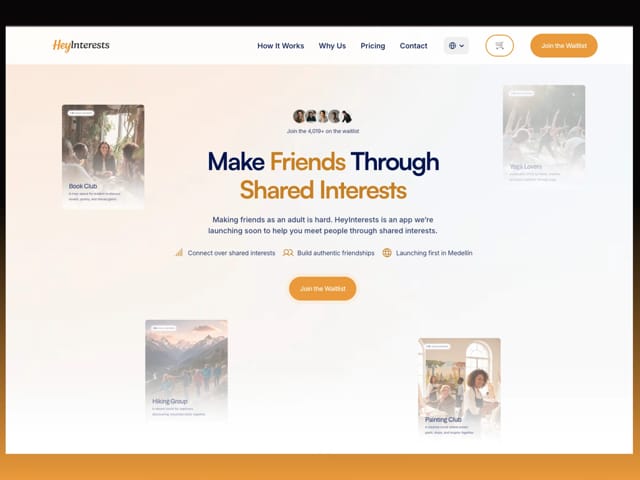
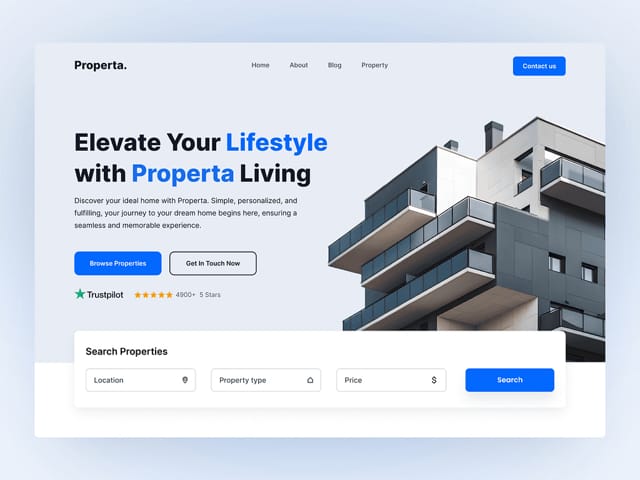
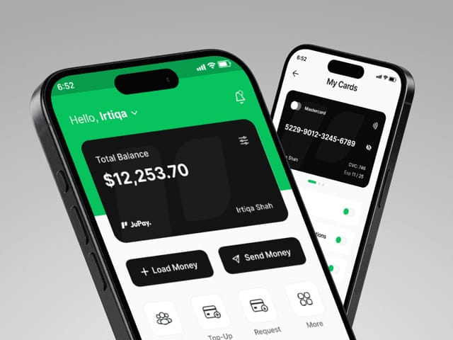
For HeyInterests, a social and community product, we led the copy, UI/UX design and build of a launch website made to grow the waitlist before the app went live, which is the same early-stage problem many marketplaces face. We designed a landing page for Properta, a real estate brand that helps people find a home, a category where listings and trust carry the page. We also designed JuPay, a cross-border finance app, where every screen had to make people feel safe moving money.
We haven't run a marketplace's growth, and we won't claim marketplace results we don't have. What we bring is copy-first design, careful trust patterns and an engineering team that can build listing and category templates properly. You can see more on our work.
How does our process work for a marketplace startup?
Intro call
A free 30-minute call about both sides, which one is scarce, your take rate and how the product works today.
Words first
We write the core promise, the lead-side homepage and the other side's page, plus the how it works and trust copy.
Design
Custom design for the marketing pages, with listing and category templates and the trust components both sides see.
Build
A Next.js site with a CMS, so your team can publish category pages, help articles and updates without a developer.
Launch checks
SEO checks on templates, mobile testing of search and sign-up paths, tracking for each side's conversion, and a handover.
Most marketplace sites fit Next.js best, because listing and category pages often come from product data. Framer or Webflow can work for a pre-launch site with a waitlist. Our startup website design page explains how we choose.
What does marketplace website design cost?
Our website package is $8,000 for up to six pages, fixed, then $500 per extra page. It includes copy, custom design, a Next.js build, a CMS and animation. If your site needs more templates or product data wired in, we scope it on the intro call. Ongoing product design and development for both sides of the marketplace runs on our $6,000 monthly retainer.
- Website, up to 6 pages
- $8,000
- Each extra page
- $500
- Design and development retainer
- $6,000/mo
Hypothetical example: a pre-launch services marketplace
For example, suppose a seed-stage startup connects small businesses with vetted freelance bookkeepers. It has 40 bookkeepers signed up and needs buyers.
A sensible six-page site leads the homepage with the buyer pitch and the vetting process, adds a how it works page with two columns, a bookkeeper page with fees and payout timing, a trust and safety page, a pricing page and an FAQ. Category pages for each service come next, once there are enough listings to fill them. This is an illustration, not a real client.
Timelines are scoped on the intro call. The next step is a free 30-minute call: bring your current site and a sentence on which side you're struggling to win. You can also compare our offers on the pricing section.