



















What does a digital health design agency do?
A digital health design agency shapes how a health product looks, reads and behaves across the brand, the app and the website. In healthtech those three can't be designed in isolation: the promise on your homepage has to match what the onboarding flow asks for, and the tone of your brand has to survive a screen that shows someone's lab results.
Most healthtech design content focuses on the marketing site alone. Our guide to healthtech website design covers that part. This page is about the wider job: digital health branding, health app design, and the product decisions that make people trust you with their health data. We write, design and build, so the words in your consent screen and the words in your hero come from the same people.
The work usually starts with a brand and design sprint, because a clear identity and ten product and website explorations give your team something concrete to react to before anyone writes code.
Who are you designing for: patients, clinicians or buyers?
Most digital health companies design for at least three readers at once, and each one judges you on something different. A patient wants to feel safe and understood. A clinician wants to know it won't add work. The buyer, whether an employer, a health plan or a health system, wants evidence, security answers and a clear contract path.
Reader | What they need to see | Where it lives |
|---|---|---|
Patient or member | Plain language, what happens next, who sees their data | Homepage, onboarding, app |
Clinician | Workflow fit, clinical oversight, how alerts reach them | Clinician page, product screens |
Employer or health plan | Who it's for, engagement approach, how it's rolled out | Solutions pages, case stories |
Health system or procurement | Security, privacy, integrations, accessibility | Trust page, security docs |
Investor or partner | Team, clinical leadership, traction you can share | About, press, investor page |
We plan navigation so each reader finds their path in one click, without splitting the brand into five different voices. Our article on digital health website pages lists the pages behind each path.
How should a digital health brand look and sound?
A digital health brand should feel warm enough for a patient and exact enough for a clinician. The common failure is choosing one. Pure clinical blue and stock stethoscopes read as a hospital vendor, which puts off members. Soft pastels and playful illustration read as a wellness app, which makes a medical director wonder about rigor.
- Type that holds data: health products show numbers, dates, dosages and ranges, so we pick typefaces with clear figures and test them at small sizes.
- Color with a job: brand colors stay separate from clinical states such as normal, attention and urgent, and no meaning depends on color alone.
- Imagery without clichés: real product, real situations or a considered illustration style, not lab coats and smiling stock patients.
- A voice that never overclaims: say what the product does and who supervises it, and avoid words that promise outcomes.
That last point matters more in health than anywhere else. Health and wellness claims fall under FDA and FTC rules, so the brand voice we write is specific without promising cures. Our guide to health claims on your website covers what to keep out of your copy, and healthcare branding goes deeper on identity.
What changes when health data touches your site or app?
Once a form, a booking flow or an app screen collects health information, design decisions become privacy decisions. Where the data goes, which tools see it and what the user agrees to all have to be planned, not added at the end. The HIPAA website guides we reviewed agree that no website platform's native forms are compliant by default, and that tracking pixels create exposure.
In practice we design three things carefully. First, forms: anything that collects health details routes to a vendor that will sign a business associate agreement where HIPAA applies, not to a generic form inbox. Second, tracking: pages a patient sees after sign-in, and pages about specific conditions, get a stricter analytics setup. Third, consent: plain-language consent screens that say what you collect and why, before the user types anything.
The rules aren't static. HHS's Office for Civil Rights has published guidance on tracking technologies, and a federal court vacated part of it in 2024, so the position on public pages is less settled than on patient portals. If you're not covered by HIPAA, the FTC's Health Breach Notification Rule can still apply to health apps. Our article on HIPAA-safe analytics and tracking explains the setups we use.
How do you design health app UX people keep using?
Health app UX has to earn attention every day without guilt or noise. People open a health app when they're tired, worried or in pain, so the first screen should show the one thing they came for and the next step, not a feed. We design around a few patterns that keep the product useful.
Onboarding that asks only what it needs
Collect the minimum to start, explain why each question matters, and let people skip what isn't required.
Results with context
Show a reading next to its range and what it means, in words a patient understands, with a path to a clinician.
Reminders people control
Let users pick timing and tone, and make it easy to pause without losing progress.
Clear escalation
Make it obvious what the app can't handle and how to reach a human or emergency care.
A clinician view that saves time
Summaries first, detail on demand, and alerts ranked so the urgent ones don't drown.
Accessibility is part of the same work. We design to WCAG 2.2 level AA, which sets a minimum contrast ratio of 4.5:1 for normal text, and test with larger text sizes because many health users rely on them. Our guides to healthcare dashboard design and healthcare website accessibility cover the details.
What does a digital health website need?
A digital health website needs to explain the care model, show who's clinically responsible, answer privacy questions and give each buyer a clear next step. We plan from this set, then trim it to what your stage needs.
- Homepage: who it's for, what changes for them, and who provides the care.
- How it works: the journey from sign-up to first result or visit, step by step.
- For clinicians and for buyers: separate pages with the proof each one needs.
- Clinical team: the medical leadership behind the product, with credentials.
- Privacy and security: what you collect, who you share it with, what you hold today.
- Pricing or coverage: cost, insurance or employer access, stated plainly.
If telehealth is central to your model, our guide to telehealth website design covers booking and visit flows.
What health and wellness work have we done?
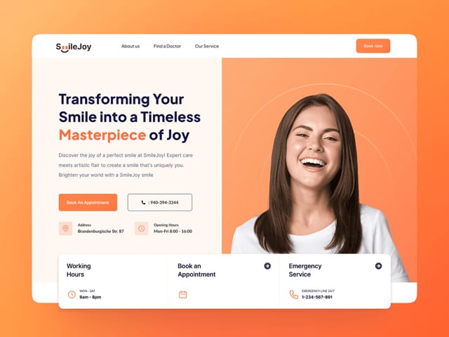
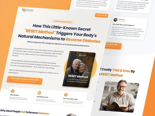
We designed the marketing landing page for SmileJoy, a dental service platform, where the job was to make a personal, high-trust service feel modern and approachable. We also designed the funnel for Reset Method, a book on a health topic, which meant turning a long sales message into one clear path a reader could follow.
Beyond health, our product work on apps such as JuPay and PowerPulse shaped how we design screens where people check sensitive numbers often. We won't claim clinical outcomes for any of this work. What we bring is a process for making a high-stakes product feel calm, clear and credible.
How does our process work for a digital health startup?
Intro call
A free 30-minute call about your care model, audiences, data flows and current brand. We recommend a sprint, a site or a retainer.
Brand and design sprint
A brand refresh or redesign plus ten website or product explorations in Figma, so you can compare directions side by side.
Words and privacy plan
We write the message for each reader and map which forms, tools and pages touch health data, for your counsel to review.
Build or ship
A Next.js marketing site with a CMS, or product design shipped with your engineers on a monthly retainer.
Launch checks
Accessibility checks, tracking review against the privacy plan, SEO checks and a handover your team can run.
What does digital health design cost?
Our brand and design sprint is $3,000, fixed, and covers a brand refresh or redesign plus ten website or product explorations in Figma. It's design only. A marketing website is $8,000 for up to six pages, then $500 per extra page, with copy, custom design, the Next.js build, a CMS and animation. Ongoing product design and development runs on our $6,000 monthly retainer.
- Brand and design sprint
- $3,000
- Website, up to 6 pages
- $8,000
- Product design and development
- $6,000/mo
Hypothetical example: sequencing the work for a seed-stage health app
For example, suppose a seed-stage startup runs a remote care program for a chronic condition and sells to employers. It has a working app but a homepage written for investors.
A sensible sequence is the $3,000 sprint first, to settle the brand and explore the member onboarding and the employer page. Then the $8,000 website, with a separate employer path and a privacy page. The app work moves to a retainer once the brand is set. This is an illustration, not a real client.
Timelines are scoped on the intro call, and health projects should allow time for privacy and clinical review. Our healthcare website cost guide explains what drives the price.
The next step is a free 30-minute call. Bring your current site, your app and a rough map of where health data flows today.